Friday 22 October 2010

Prelim Task, Magazine Cover


My original photography


i had change the toning of my original image by brightening up the white tone, in the background, and givin it a daylight glow, this enable my cerius pink masthead to stand out amongst the rest of the freming for the mag.i also rescaled the image in order to make it look an aproriate size for a front cover.

The way in which i did this was;


i canged the level of emboss by 25% reduction, giving the image a faded washed out look.


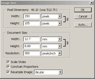
i also rescaled the size of my image, this is how i adjust my imagery to fit with the magazine

Tuesday 19 October 2010

Prelim Task, Contents Page


I think by using contrasting colours such as black, pinks ad white, it really accurately target my audience of 14-21 year old girls. Pink is almost always seen as a more femininne colour along twith the white gives it a passive, fresh tone. I have also kept my main layout font of the front cover as it gives the mag a real sense of consistancy. My page numbers and articles are clearly presented, so the reader understand what page goes with each article, and so they are aware of the content in my mag.


This image i took has bright colours and shows and side of excitement and fun inside acland burghely, it shows different elements of education, e,g through performing arts and ect. i think it is a good image to use on my contents page  for my school magazine as it is familiar surounding for students in the school.


this picture shows education and learning in aclandburghley as a bright, good experience, the vibrance and natural brightness shows the positivity that i am trying to portay through the curiculum in acland burghley, givin it a very good overview for the readers of the magazine.


This picture i put on my contents page for humour, to show the element of imaturity and school day, this shows a fun side to school life, and will heavily relate to my targeted audience.


This picture shows the sort of clubs and workshops acland burghley school take part in, and what they heavily believe in is recycling and taking care of the enviroment in which we live in. Its shows the passion and intensity of comittement the school has in this area.


This picture is mainly to show students that attend the school, and to show the enjoyment they have attending school.

Friday 15 October 2010

Magazine comparison

i've annotated VIBE magazine; urban selection aimed at hip hop and RnB listeners. The generic music convention codes emploed by the magazine suggest the target audience are young people on the go and enjoy having fun.  The main image on the front cover is of a well known American rapper artist 'T.I', He is of african american decent, which tells me the mag is aimed at a multicultural target audience.  The main colour schemes used is black, red and white, which are usually seen as male colours, the colour red is also a very vibrant colour, this infers to the reader that it is a energetic males magazine.
The layout of the image Is shown to be the most important as it symbolises a sense of youth.
The typography and mode of address, is more of an informal (slang) type of address, e.g. " aint no such thing as a secret snitch" this is appealing to a certain group of people young people's of  african american decent.


The second magazine I chose to annotate in comparison with VIBE is 'KERRANG' magazine.
The particular front page i chose to study has a band named Machine head', i can tell that the magazine is aimed at an audience that prefer the genre of rock music because the artists on the front page look ruthless and out of control. The poses strike the eye of the reader the most because one member of the band is grabing the othere with his arm and they are all staring at the camera with madness and intensity. Also the artists are wearing gothic make-up which tells me as a reader that they follow a fashion trend that the stereotype would wear. Aswell as the band, there are many other images reflecting tasters of whats inside the mag, whereas, in Vibe magazone there is only the one main image used. 


Saturday 9 October 2010

COMPARISONS OF BLOGS

For my personal value i researched a wide variety of different blogs such as Film blogs, Music blogs and Scientific blogs, this could give me a better idea of the things contained on blogs:
Film blogs I looked at:
- http://www.guardian.co.uk/film/filmblog
- http://www.bbc.co.uk/blogs/markkermode/
- http://www.fadedglamour.co.uk/

Music blogs I looked at:
- http://www.guardian.co.uk/music/musicblog
- http://www.buzzinmusicblog.co.uk/
- http://www.livemusicblog.com/

Scientific blogs I looked at:
- http://scienceblog.com/
- http://www.guardian.co.uk/science/blog
- http://www.ox.ac.uk/media/science_blog/

One thing i found common among all of these blogs was that the layout was very easy on the eye. I think his is a good quality to all of these blogs as they were easy to read and configure. I also found that the blogs had adapted to their genre of the blog. For example, the live music blog had theme colours of red and white to show the vibrant feel of live gigs, but white so that the text on the blog was easy to read.

By looking at these different blogs, I have learnt that the blogs that had more hits and were more interesting were fairly plain, with detail highly related to the purpose for the blog. Using this information I know that I should keep my blog simple and informative but with the information I need, laid out in different ways.

Tuesday 5 October 2010

Uses And Gratification Theory

Uses and Gratifications is broken down in to four different parts. These justify why people feel a need for media and why it is consumed so much.

Diversion - A form of escape or release from everyday pressures (e.g. Movies (cinema), T.V, Consoles, Facebook, Radio)

Personal - Comparing your life with characters or situations on screen (e.g. Big Brother, Tabloid News, I'm a Celebrity get Me Out Of Here)

Personal identity - Looking at someon else's situation and comparing it to your own, looking at different outlooks on the world (e.g. celebrity lifestyle, chased by paparazzi)

Surveilance - Information about 'What's going on in the World' (e.g. e-mail's, Facebook, News, Gig guides)

All magazines use these to base their purpose on as these are the reason's for consumtion. When producing my magazine, I will consider all four of these and remember that reader's will consume my magazine for any of these four reasons and so to make a successful magazine, I will cover all four considering all possible reader's and their reason's for consuming my publication.

Sunday 3 October 2010

MASTHEAD RESEARCH

For my masthead research i have studied in detail the mastheads of four magazine publications. the magazines i have based my masthead analysis on is 'Top Of The Pops' , 'MixMag' , 'Vibe' & 'NME'. I chose these because they all show very different styles of masthead of music magazines.


Top of the pops uses a simple form of typography, bubble writing which gioves it a sense of softness and a layed back attitude (not formal). This therefore will appeal more so to the audience of a younger generation 16 and under. The lettering is curved and round almost hinting a sense of fun and safety, innocence in a sense which will also appeal to children. The colour of the typography is pink and yellow, these two colours are stereotypically know as "girlie" colours, that usually appeal to young girls in there early teens, roughly targeted at an age group of 8-14's.
The language used is very informal, adressing in a commen manor, plus the masthead also 'clearly' indicates the genre as pop, making the reader aware that it will be featuring artist that belong to the popular music genre.


Mixmag masthead typography is very similar in a sense of the rounded curved shape of the lettering, both publications have used bubble writing on their masthead. however even thought they are very similar the two music magazines do not appeal to the same market. This is evident as mixmag's content contains long , detailed articles and features that will appeal to an older generation. Even though mix mag doesnt have a very formal approach in language used in articles and things advertised , mixmag is still said to be one of the high market music magazines and is retailed at £4.20 per month. This mag most likely appeals to people in A - C class spending brackets.

Mixmag uses a simple block of colour for its masthead every issues, to represent the mood of theme for that month, however most commonly its masthead is white, representing to the reader a sense of freshness and something, but also bold and eyecatching. With a lack of heavy detail, it symbolises simplicity and maturity and complex designs and wide ranges of colours are usually found in teen or young adult targeted magazines.


NME uses the the colours red, black, and white. These are all commonly found within rock magazines and has over the years created itself a colour theme that when seen it may be associated with the rock genre.  

The typography used is a simple block capital format yet still has an eye catching vibe through the majority of the colouring used is red. The font may have been kept to a simple tone to prevent the the masthead being over crowded with gimmicks.  This can also hint that the target audience is of a mature nature and do not want to be shown a magazine masthead that over shadows the information produced on the front cover about the contents of the magazine.